Posts tagged Websites
Project Selling at The Home Depot

Project Selling at The Home Depot

UX Manager, UI Design, Creative Direction, Marketing

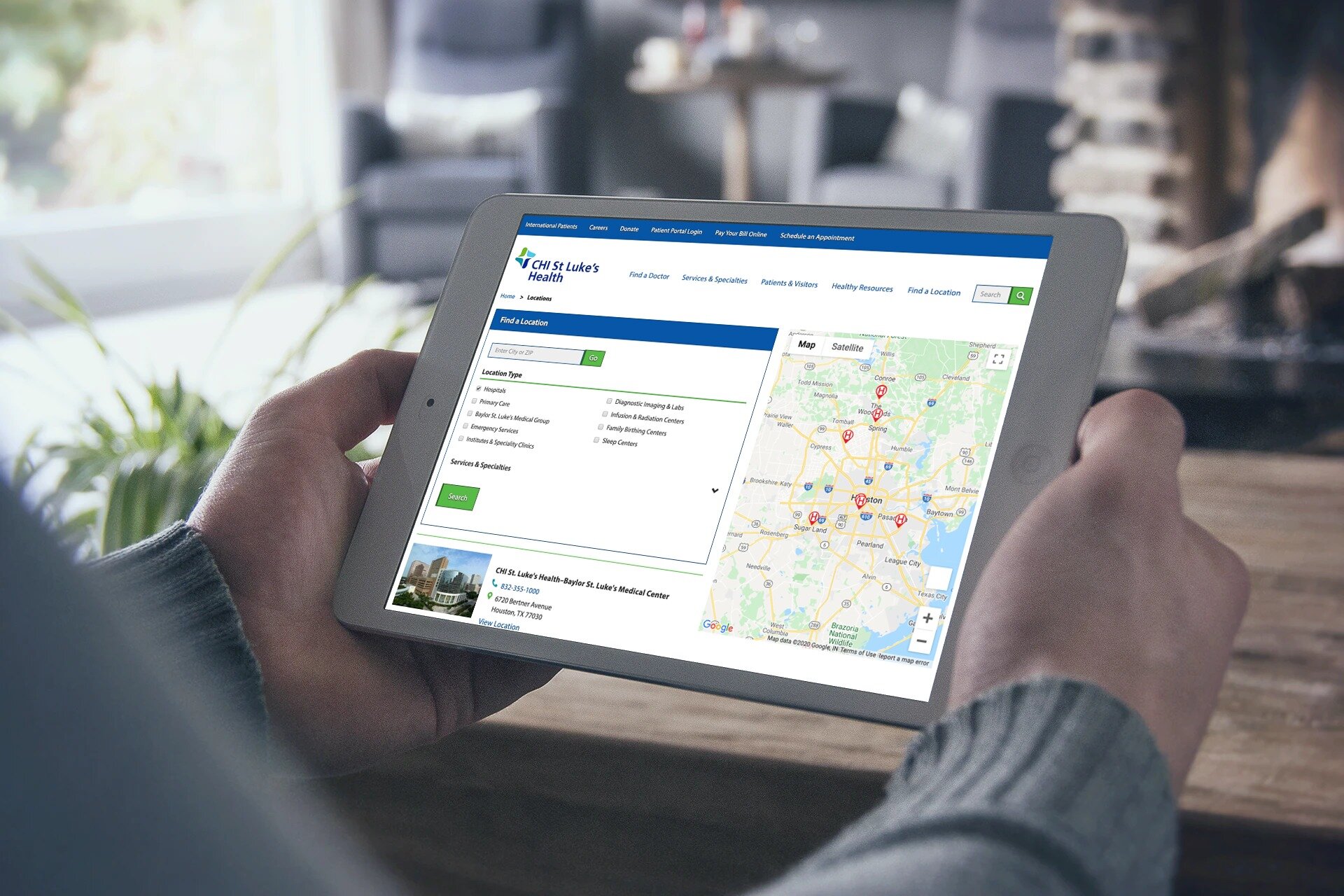
Gibson joined The Home Depot in 2018 as Sr. Manager, User Experience at Global Custom Commerce, focusing on selling the complete project in store and online. The Home Depot uses mature UX practices to lead as the number 1 retailer online for User Experience (view the list).


UX Manager at The Home Depot

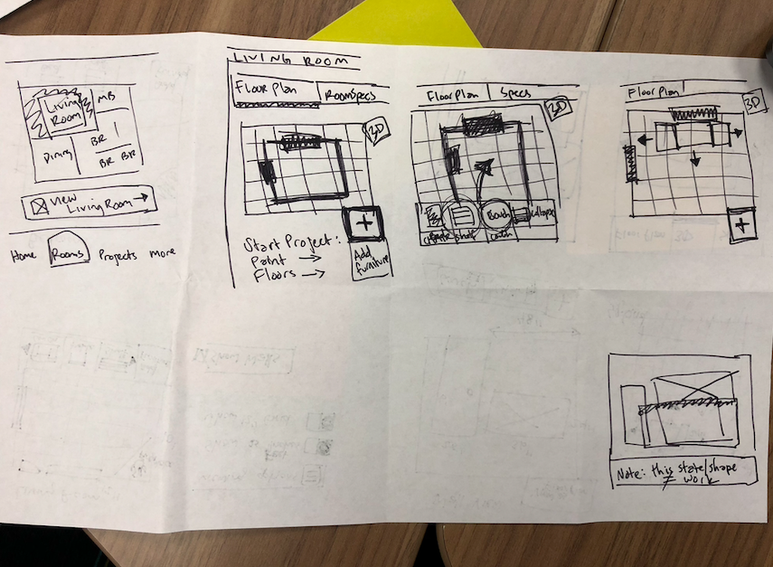
The UX Team manager is responsible for UX Research and UI Design. The team partners with Product Managers and Engineers to create experiences that are straight-forward for customers and associates to use. The UX Team focuses on selling complete projects, giving the customer the right type and amount of products needed in one easy experience to have delivered or picked up in store.

If you want to view more of my work at The Home Depot, contact me.

Top Highlights

  • Leads UX “Project Selling” department with talented UX Researchers and UI Designers for top eCommerce store in the US

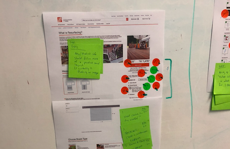
  • Responsible for driving user tested designs to HomeDepot.com and the mobile app

  • Improving HomeDepot.com with KPIs driven by In-Store & Online Sales

  • Grows the UX team with A/B testing, Usability Studies, In Person Moderated Testing, and Analytics

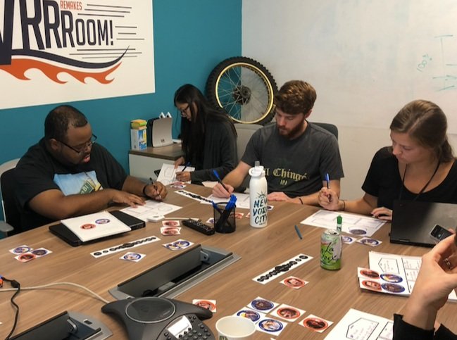
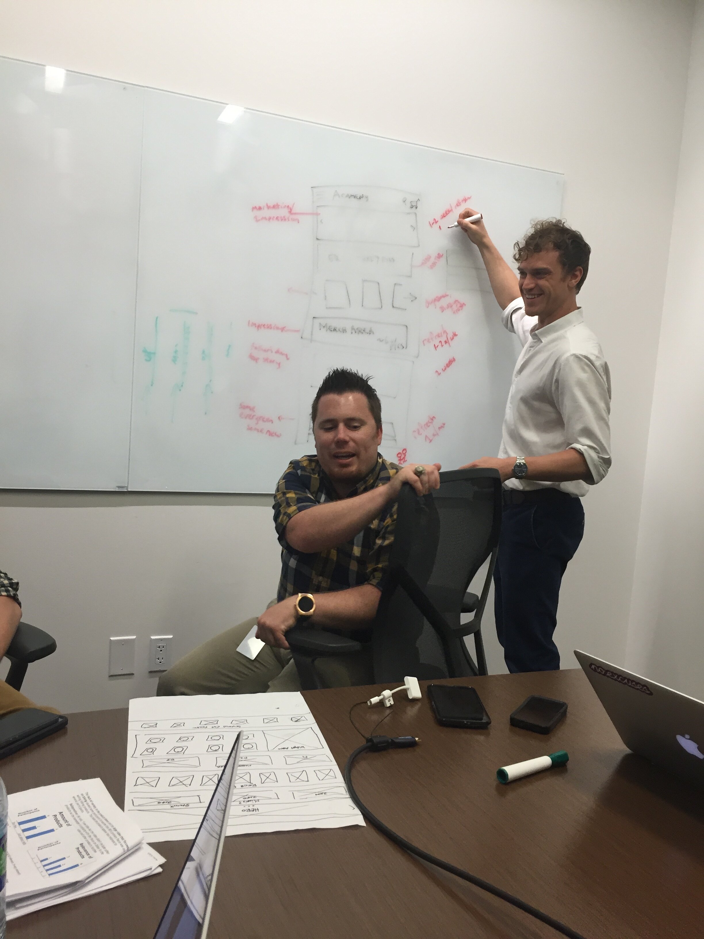
  • Regularly hosts workshops for Design Thinking and leads Design Studio sessions


PortfolioGibson HallWebsites
Healthcare Website Design & Development
CHI St Lukes Redesign  Responsive Website Layouts.png

CHI St. Luke’s Hospital

Creative Direction, UX/UI Design, CMS Strategy & Development, Project Management

While working as Creative Director for a top digital advertising agency in Houston, Gibson led the team to oversee an enormous website redesign for a large hospital and healthcare system. The project involved more than 1,500 pages of content to rewrite, structure, and deliver in an easy, Accessible, and HIPAA compliant responsive website.


waterfall process.png
CHI St Lukes Hospital Personas Doctor.png

Personas and User Research

Before beginning on any design or development, it’s most important to first know who you are designing for and their website goals.

This project had unique personas for Patients, Physicians, and Administrative staff. Requirements were gathered through Moderated User Testing, User Surveys, and looking at the analytics of the current website.

We discovered each persona has different reasons for visiting the hospital website from booking appointments to clocking in-and-out for staff. The website must be easy for all visitors, and be optimized for mobile, tablet, and desktop screens.

CHI St Lukes Wireframes and Journey Map.png

Information Architecture

Information Architecture for the site was extremely important as we created the navigation and easy ways to find elements like Schedule an Appointment and Find a Location.

Using information collected during stakeholder interviews and looking at website analytics, we determined the main paths to create the best user experience.

CHI St Lukes Wireframes.png

Wireframes

Wireframes are created much faster than traditional mockups because the focus is not on color or typography. Instead, wireframes focus on structure and flow, in order to get user feedback and help the development team start a creating the site architecture.

CHI St Lukes Website Style Guide UI.png

Style Guide

The project planning roadmap gave designers a head start on establishing branding and design patterns of the website. We were able to use placeholder copy to create elements like buttons and headings.

The style guide created matched the branding standards of the print materials owned by the organization. We updated the brand standards to include text color to be used (and also not used) on different backgrounds to ensure accessibility 501(c)(3) standards are met.

After establishing a style guide for the website, it is easier to create high fidelity mockups for different parts of the website.

CHI St Lukes Modular Atomic Responsive Web Design.png

Card Sorting & Atomic Design

After creating the wireframes and information architecture for the entire website, we were able to come back to give individual layouts to key pages like the index/home screen, services, and locations.

Atomic Design allows us to create molecules, or components, that are easily repeated on different screens. For example, we wanted an “Email Sign Up” box so visitors could stay up to date on community events. We didn’t want to make a main navigation link for this, but wanted users to find it easily on multiple pages during the experience. For this reason, we made reusable & modular components.

CHI Responsive.png

User-Centric Layout

Using the modular components, we took testers through Card Sorting exercises to help determine priority and expectation of key pages. During our testing, we had testers organize the components from top to bottom, as if this was a mobile design layout.

We learned what information testers expect at the top of the page, and what information is less important. Merging user expectations and business goals, we were able to create a user-centric layout.


CHI St Lukes Redesign Background.png

Final Product

CHI St Lukes Redesign  Responsive Website Layouts.png

Mini Murals Project
Mini Murals Cover Image.png

MiniMurals Houston

Project ideation, Marketing, Web Design, Social Media Strategy, Digital Strategy

  • Client: UP Art Studio

  • Timeline: June 2015 — current

  • Services: Web Design, Project Management, Social Media Strategy

I walked into a big board room in Spring 2015 with a map of the City of Houston. The map included green, yellow, and red pens throughout Houston, with a green one down the street from my childhood home. I was immediately confused why MY neighborhood and street was highlighted on this map, and what it was symbolizing. It was the start to a city-wide art transformation, which I couldn’t be more proud of to create and support.


MiniMurals started in 2015, when Noah and Elia Quiles of UP Art Studio approached me about helping with this project. We already worked together on several other large mural and art projects, and I became their digital marketing partner. Together, we were able to grow the Mini Murals project to over 250 boxes with more than 40 artists across the City of Houston.

Work Involved

In 2015, I created the MiniMurals.org website, including an interactive map locating each mural and connecting the painting to the artist. Each artist bio describes their work, and displayed their paintings on a single map. Today, there are more than 250 Mini Murals and 40 artists on the website and the project continues to grow.


Academy Sports + Outdoors
Responsive Product Details Page

Responsive Product Details Page

ACADEMY.COM

Website Design, User Experience, Cross-Channel Marketing

As lead User Experience Researcher for Academy Sports + Outdoors, Gibson helped create omnichannel shopping experiences online, in the mobile app, and for associates in more than 700 stores. Gibson created experiences for Browsing & Navigating the website, Viewing Product Information, and Completing the Checkout Flow.

While working for Academy.com, Gibson led the UX research to completely rebuild the website to be Fully Accessible (ADA Compliant) and Responsive, while maintaining the same backend and no downtime.


UX Process Defined and Followed

Academy UX Process.png

UX Research Methods Practiced


UX Design For Academy.com

academy sporst and outdoors responsive website design - phone 2.jpg