Healthcare Website Design & Development

CHI St. Luke’s Hospital
Creative Direction, UX/UI Design, CMS Strategy & Development, Project Management
While working as Creative Director for a top digital advertising agency in Houston, Gibson led the team to oversee an enormous website redesign for a large hospital and healthcare system. The project involved more than 1,500 pages of content to rewrite, structure, and deliver in an easy, Accessible, and HIPAA compliant responsive website.


Personas and User Research
Before beginning on any design or development, it’s most important to first know who you are designing for and their website goals.
This project had unique personas for Patients, Physicians, and Administrative staff. Requirements were gathered through Moderated User Testing, User Surveys, and looking at the analytics of the current website.
We discovered each persona has different reasons for visiting the hospital website from booking appointments to clocking in-and-out for staff. The website must be easy for all visitors, and be optimized for mobile, tablet, and desktop screens.

Information Architecture
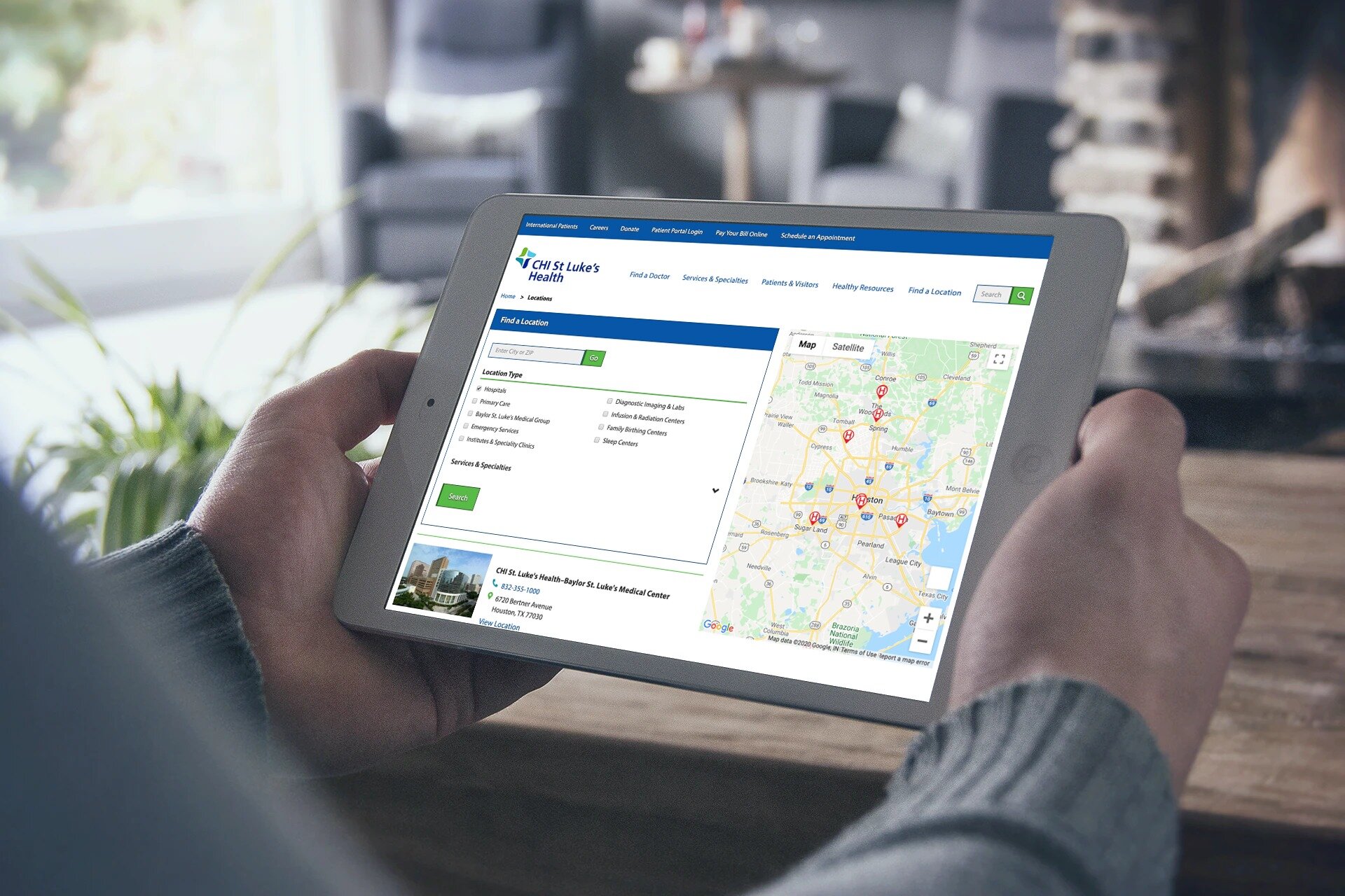
Information Architecture for the site was extremely important as we created the navigation and easy ways to find elements like Schedule an Appointment and Find a Location.
Using information collected during stakeholder interviews and looking at website analytics, we determined the main paths to create the best user experience.

Wireframes
Wireframes are created much faster than traditional mockups because the focus is not on color or typography. Instead, wireframes focus on structure and flow, in order to get user feedback and help the development team start a creating the site architecture.

Style Guide
The project planning roadmap gave designers a head start on establishing branding and design patterns of the website. We were able to use placeholder copy to create elements like buttons and headings.
The style guide created matched the branding standards of the print materials owned by the organization. We updated the brand standards to include text color to be used (and also not used) on different backgrounds to ensure accessibility 501(c)(3) standards are met.
After establishing a style guide for the website, it is easier to create high fidelity mockups for different parts of the website.

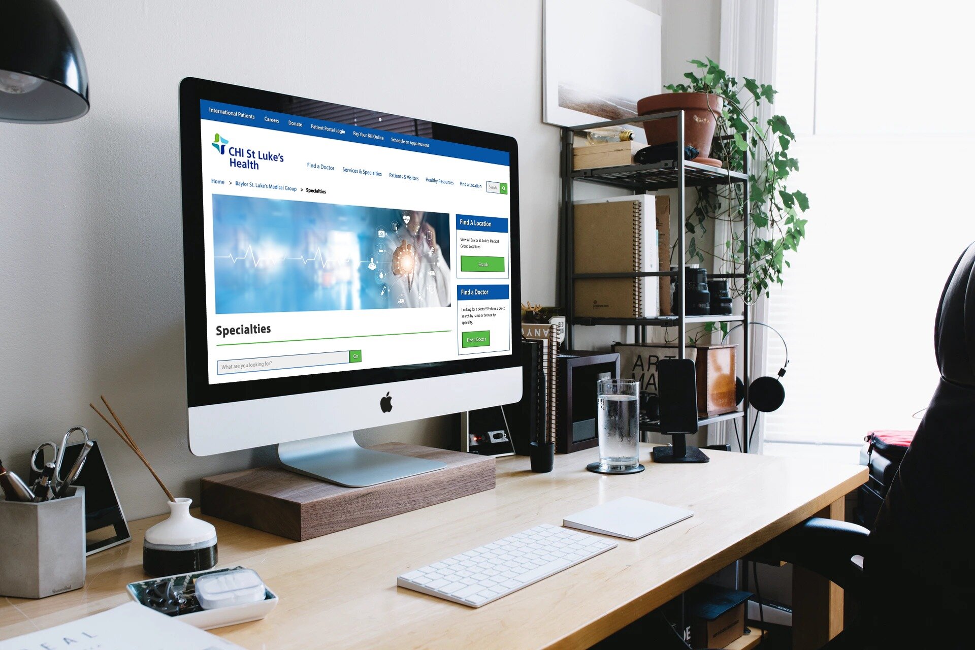
Card Sorting & Atomic Design
After creating the wireframes and information architecture for the entire website, we were able to come back to give individual layouts to key pages like the index/home screen, services, and locations.
Atomic Design allows us to create molecules, or components, that are easily repeated on different screens. For example, we wanted an “Email Sign Up” box so visitors could stay up to date on community events. We didn’t want to make a main navigation link for this, but wanted users to find it easily on multiple pages during the experience. For this reason, we made reusable & modular components.

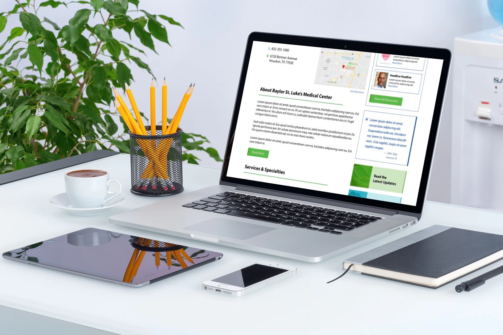
User-Centric Layout
Using the modular components, we took testers through Card Sorting exercises to help determine priority and expectation of key pages. During our testing, we had testers organize the components from top to bottom, as if this was a mobile design layout.
We learned what information testers expect at the top of the page, and what information is less important. Merging user expectations and business goals, we were able to create a user-centric layout.

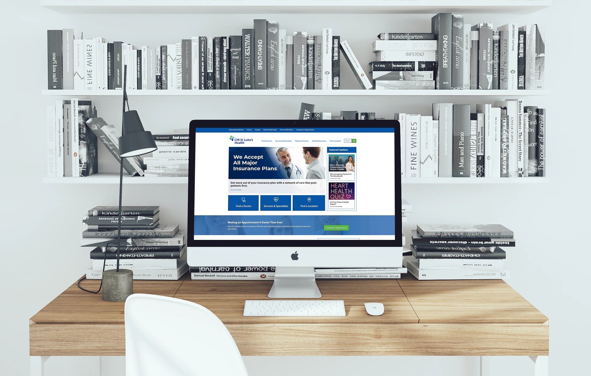
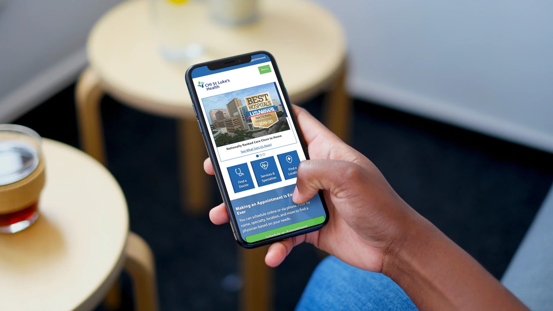
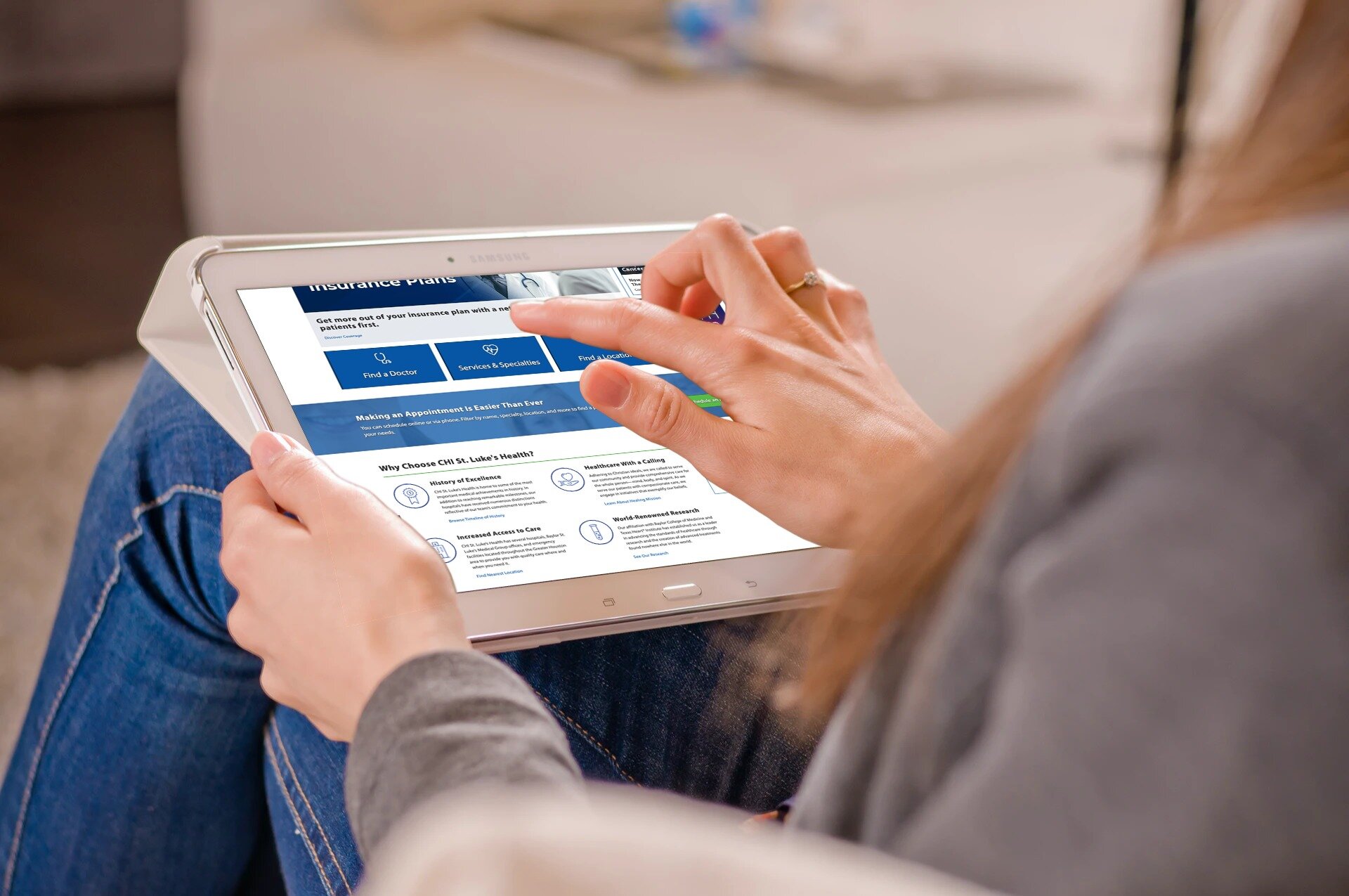
Final Product